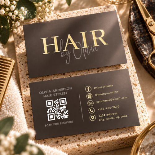
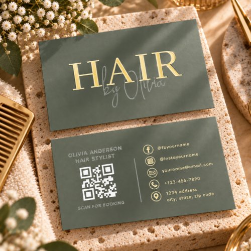
Hair Stylist Business Cards: Compare Two Layouts
Use the two hair stylist catalog examples below to compare layout choices, not to assume that one is universally better. Choose the version that makes your most important contact detail easy to find at printed size.
Quick checklist
- Compare the contact hierarchy
- Check small-text readability
- Review both sides
- Choose for your daily use
Compare the same information
Imagine name, specialty and a direct booking route on each layout. Compare where a reader’s eye lands first, how the contact details are grouped, and whether the business name remains legible when the preview is reduced.
Look beyond color
A different background or type treatment may suit your brand, but clarity depends on the exact personalized text. Long names and URLs can wrap differently from the sample. Inspect each customized proof instead of assuming the original spacing will remain.
Compare practical use
Review both sides, space for a scan prompt or appointment field, and the contact route you actually use. These examples are design starting points; no claim is made that one will generate more bookings or sales.
Make the final selection
Keep changing prices and long service menus on your booking page. Check the available options and cost on the product page. Pick the layout that keeps your real information readable, then perform a separate final proof check.
Catalog examples to explore
These are genuine product previews, shown without changing the design. Personalization, materials, availability and price are confirmed on the product page.