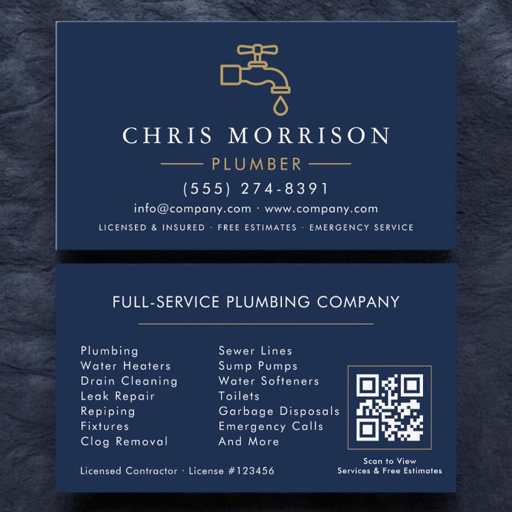
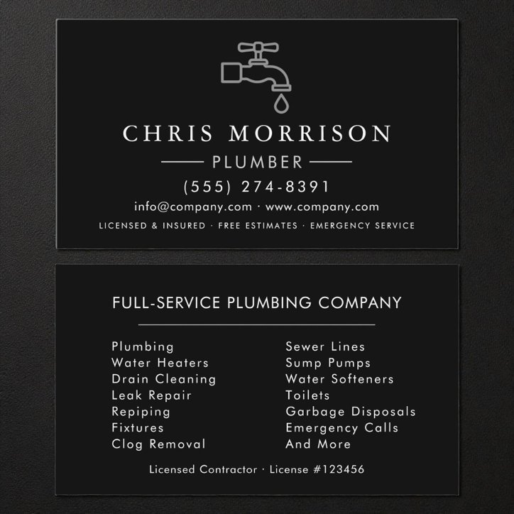
The short answer
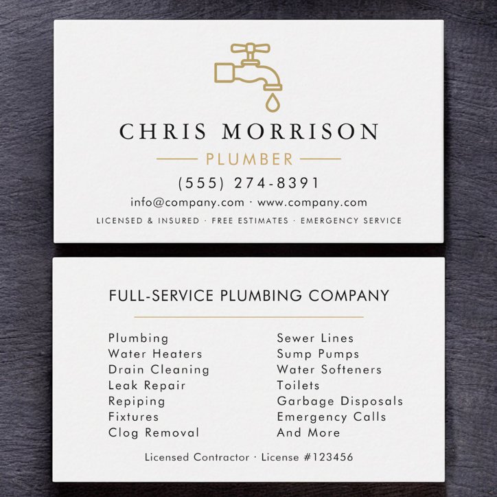
Include your company name, plumbing specialty, phone number, service area, website or QR code, and license information where applicable. The front should establish the business and specialty quickly. Give the back one clear supporting job, and make the preferred next action—usually to request an estimate—easy to understand without requiring a scan.
Build the front around plumber recognition
Emphasize plumbing services and the fastest contact method. Emergency or 24-hour wording should be prominent only when it is truly offered.
The first reading layer should tell a prospective customer who the card is for and what kind of work is offered. The business name, professional role, and primary contact path should remain readable at actual card size.
- Business or professional name
- Clear role or specialty
- Primary phone, email, or website
- Location or service area when relevant
- Accurate credentials or trust information where appropriate
Give the back one useful job
For a plumbing professional, the back works best as a concise service list, service area, estimate prompt, or QR code to project proof. It should add information or an action rather than repeat the front in a different arrangement.
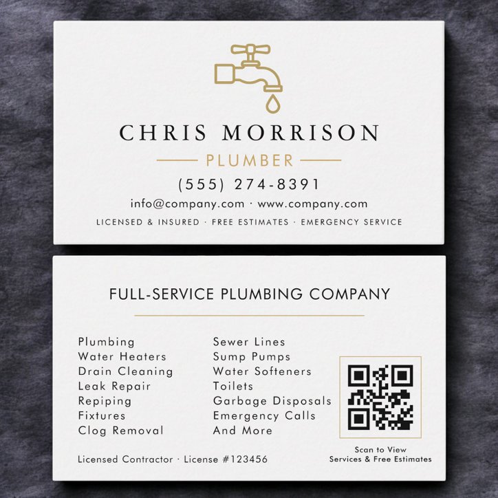
Decide whether a QR code earns the space
A QR code is useful when it shortens the path to a short estimate form, service-area page, project gallery, or maintained quote page. Label the action so the customer knows why to scan, keep a printed contact option, and test the final code from a paper proof before ordering a large quantity.
- Use a stable destination you control
- Send visitors to the next useful action
- Keep the printed card understandable without scanning
- Test the final-size code on more than one phone
Choose a design that fits plumber work
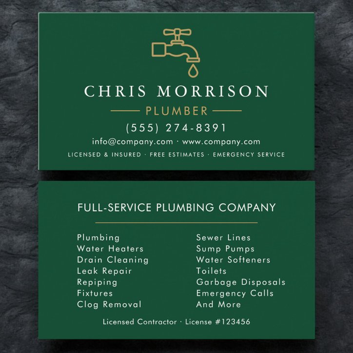
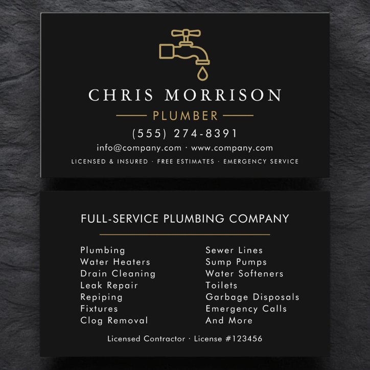
Navy, blue, white, and metallic accents feel dependable and established. Strong type usually performs better than overly literal plumbing graphics.
A photograph can demonstrate the work or support recognition; a logo can build a repeatable company identity. Use whichever asset is genuinely strong. Avoid decorative elements that reduce contrast, crowd the contact information, or make the specialty harder to identify.
- Use one clear visual direction
- Keep type readable at actual size
- Limit the service list to priority work
- Verify every contact detail and applicable disclosure