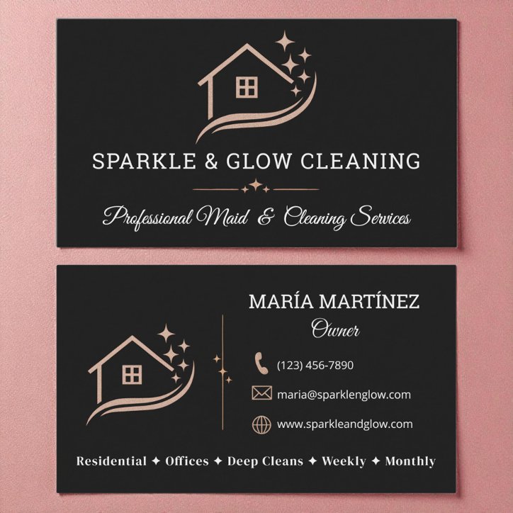
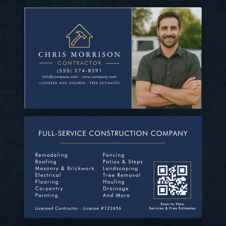
The short answer
Choose horizontal when you want the most familiar reading flow, room for a long business name, or conventional handling in card holders. Choose vertical when the logo, portrait, monogram, or short identity benefits from a taller composition. Neither orientation is inherently more professional. The better choice is the one that keeps the service and contact path clear at actual size.
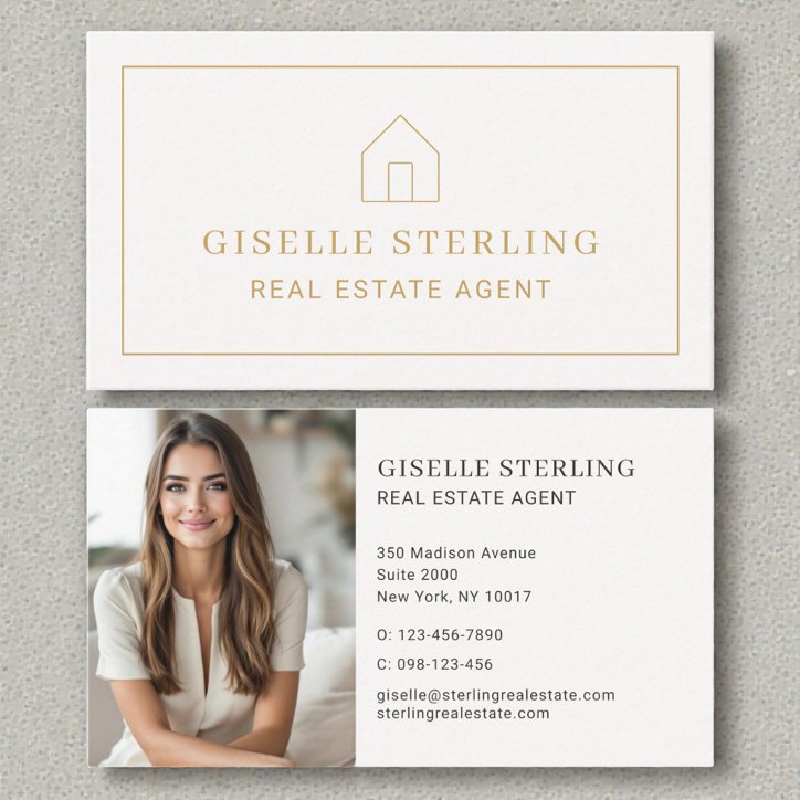
Horizontal supports familiar scanning
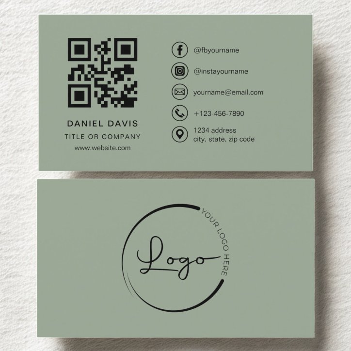
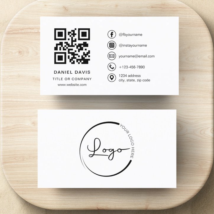
Landscape cards naturally accommodate left-to-right names, long company titles, addresses, service lines, and contact rows. They also align with many wallets, holders, scanners, and desk displays.
- Useful for long names and titles
- Familiar contact-information flow
- Easy to divide into image and text zones
- Works well for service lists and appointment backs
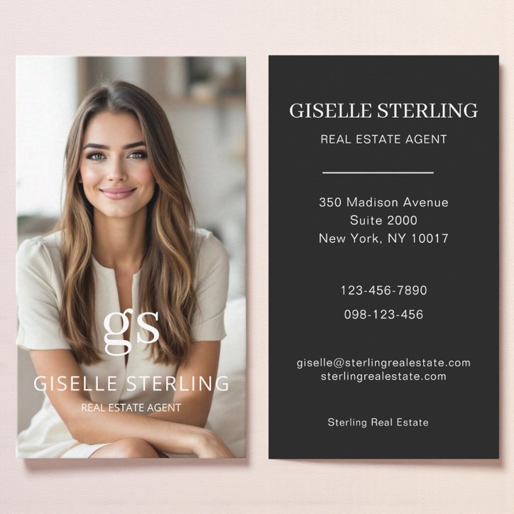
Vertical creates a deliberate focal point
Portrait orientation can emphasize a headshot, tall logo, monogram, or compact luxury composition. It needs disciplined editing because long contact lines can become narrow or require smaller type.
- Strong for portraits and monograms
- Distinctive without adding decoration
- Requires shorter lines
- Check how it will sit in holders and displays
Let content shape the orientation
Sketch the actual name, role, business, and contact details in both orientations. Do not choose vertical merely to be different if it forces tiny type, awkward line breaks, or a crowded QR code.