The short answer
Choose matte when readability, restrained color, tactile feel, or handwriting matters. Choose glossy when vivid photography, deep color, or a polished image-forward presentation is the priority. Neither finish is automatically more professional. The right choice depends on the design, available product options, lighting, and how the card will be handled. Compare the current finish descriptions and preview before ordering.
Matte favors restraint and practical handling
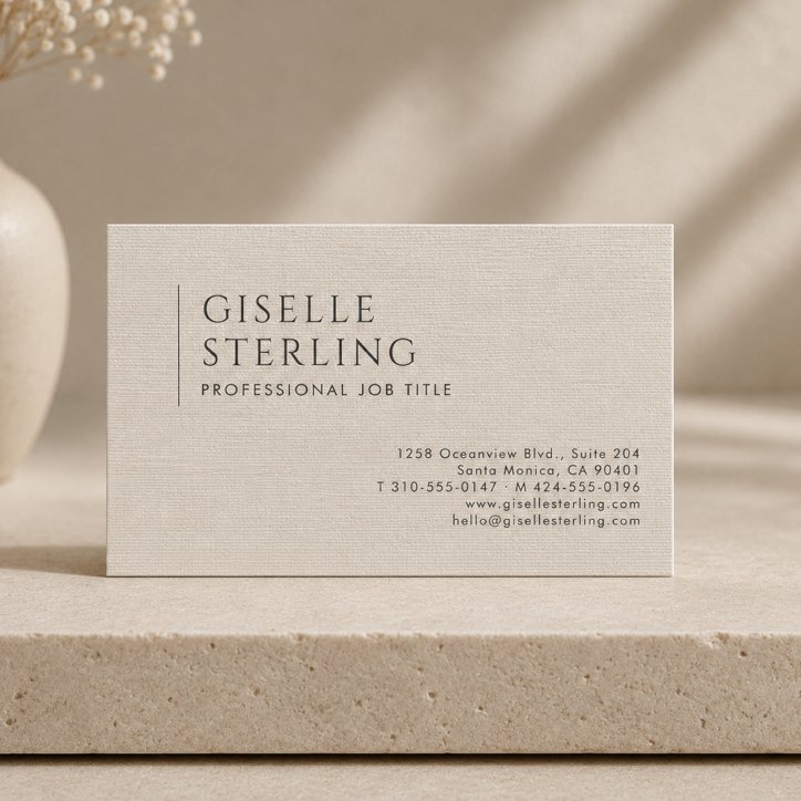
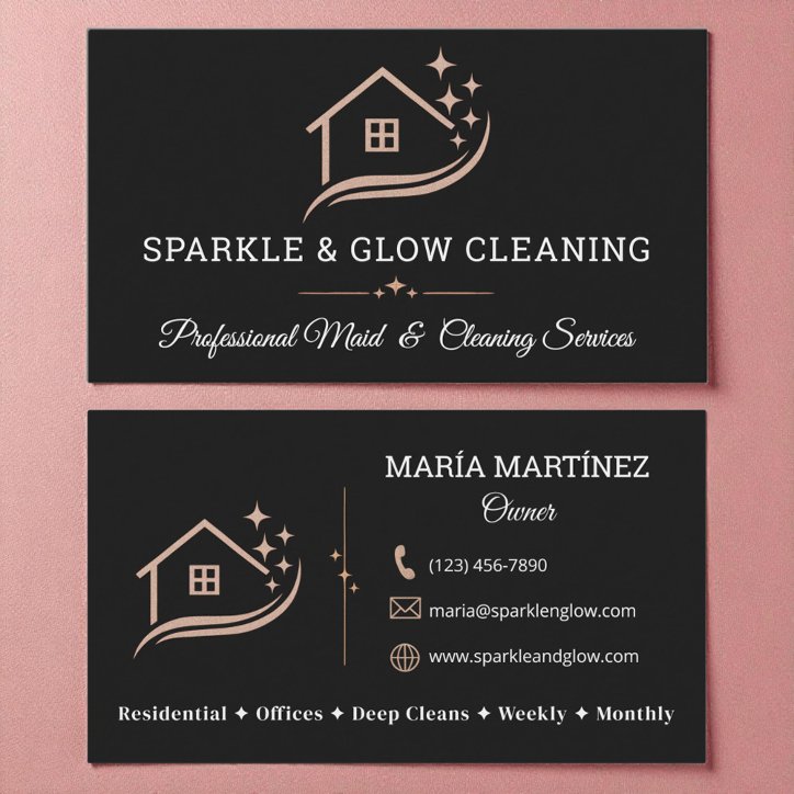
Matte surfaces generally reduce glare and can suit typography-led, neutral, professional, appointment, or note-friendly cards. Confirm writability for the exact product and pen rather than assuming every matte finish behaves the same.
- Lower-reflection appearance
- Strong fit for text-led layouts
- Often suits understated palettes
- May be preferable when notes are part of the use
Glossy favors image and color impact
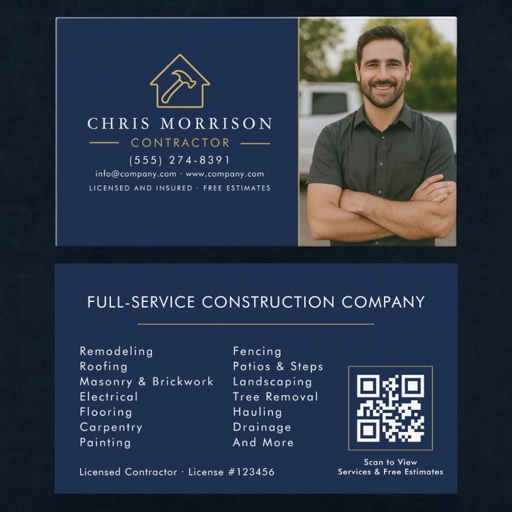
Gloss can enhance the sense of depth in photography and saturated color, but reflected light can affect readability. Keep small text high-contrast and avoid relying on very subtle tonal differences.
- Useful for vivid photos
- Can strengthen deep colors
- Consider glare under bright light
- Usually less suitable for handwriting
Let the card’s job decide
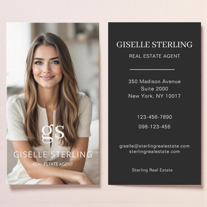
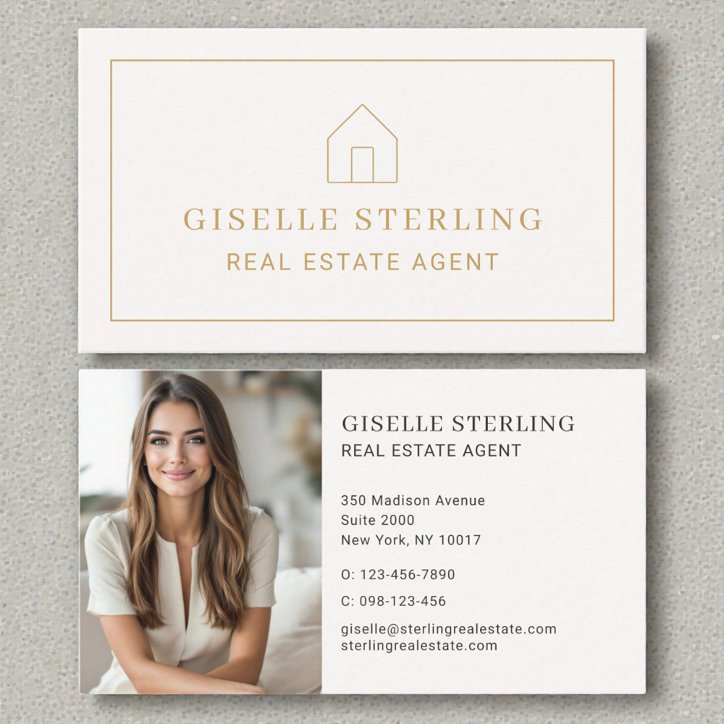
A photographer, real estate agent, stylist, or restaurant may prioritize visual imagery. An attorney, consultant, therapist, or appointment-based office may prioritize calm readability. Review the available finish options for the exact Zazzle product because names and specifications can change.