The short answer
Do not crowd a business card with every service, social account, slogan, credential, and contact route. Avoid outdated information, unverified claims, tiny type, unexplained QR codes, and details that will change quickly. Prices rarely belong unless the offer is stable and central to the business. The card should help someone recognize the business and take one clear next step.
Remove details that compete with the purpose
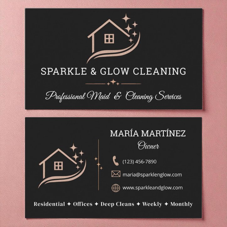
A card is a prompt for recognition and contact, not a complete brochure. Long mission statements, full service catalogs, several taglines, and every social platform weaken the visual hierarchy.
- Long paragraphs
- More than one primary call to action
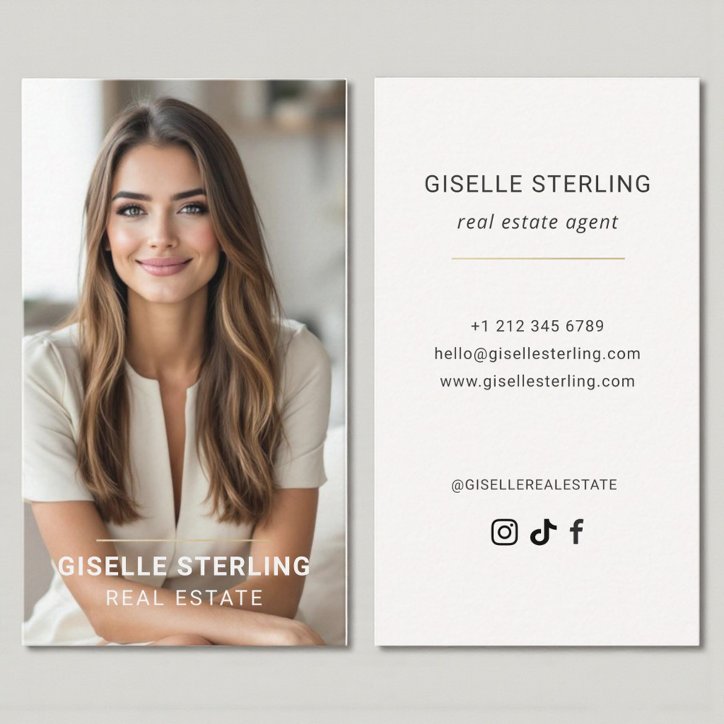
- Inactive social accounts
- Information repeated on both sides
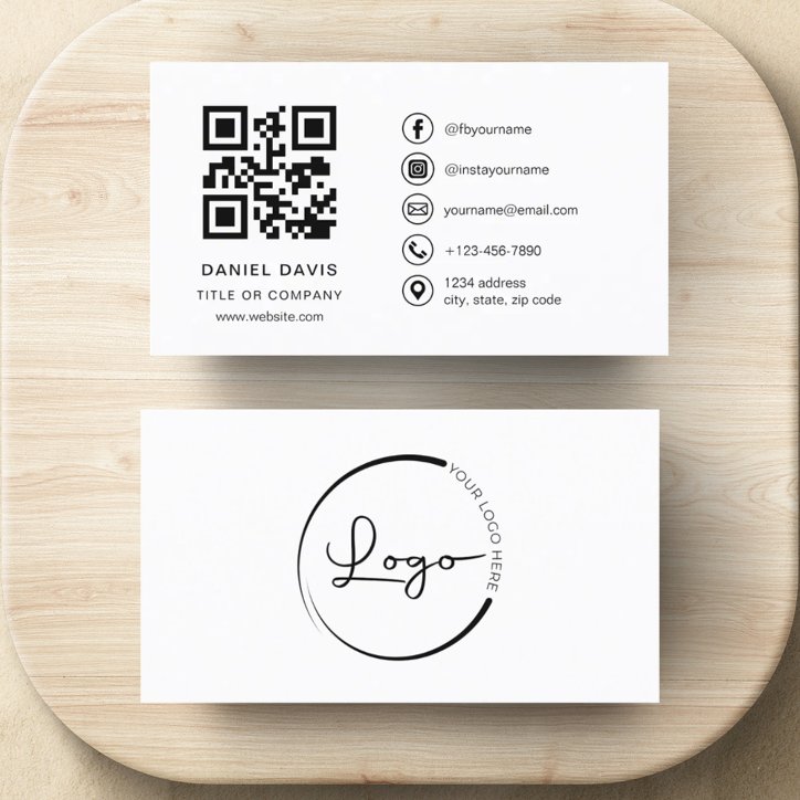
- Decorative icons that do not improve understanding
Avoid claims you cannot support
Words such as licensed, insured, certified, specialist, or award-winning should appear only when accurate and permitted. Professional requirements can vary, so use exact credentials rather than broad claims.
- Do not invent popularity or ranking claims
- Do not use expired credentials
- Do not imply a location you do not serve
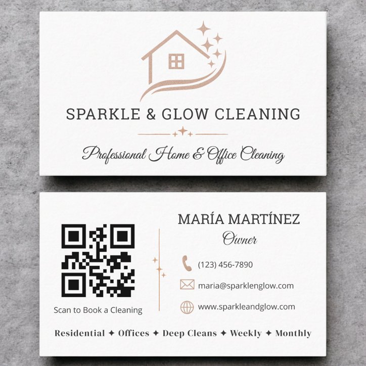
- Do not use a QR destination you have not tested
Do not sacrifice readability for completeness
If the last line requires very small type, the solution is usually editing, not shrinking. Move useful secondary content to the reverse, a website, or a QR destination.