The short answer
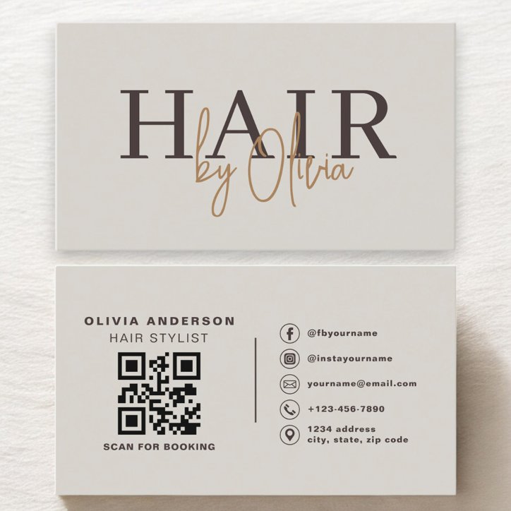
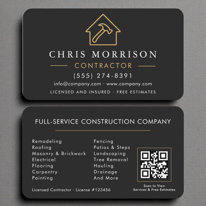
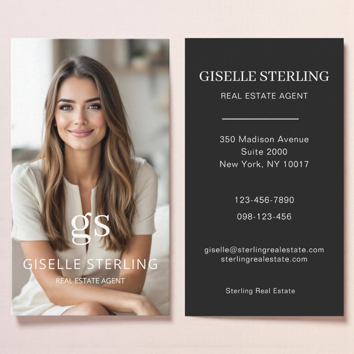
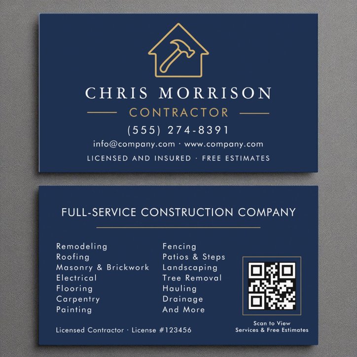
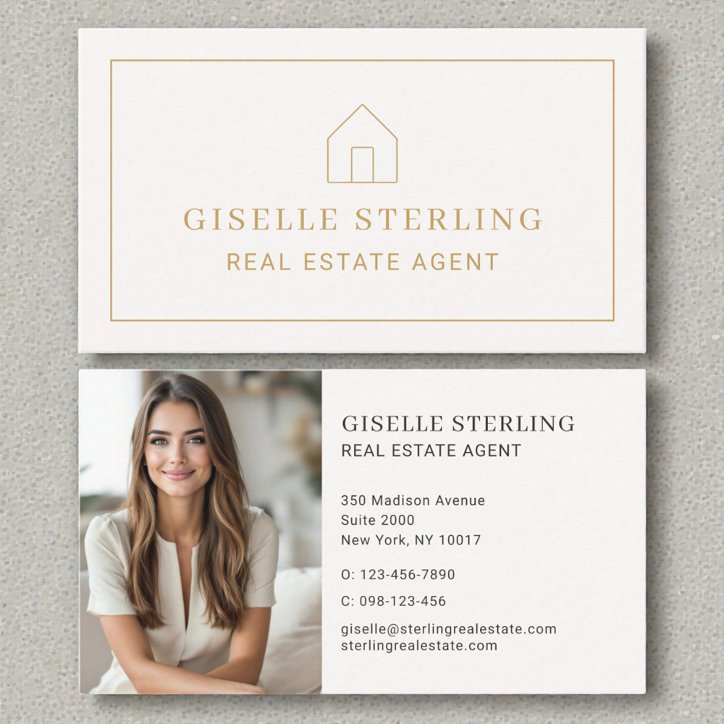
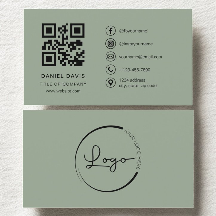
The back of a business card should support one useful secondary task. Good options include a QR code with a clear instruction, two to five priority services, appointment-reminder fields, a portfolio or project image, a short referral prompt, or intentional note space. Avoid simply duplicating the front. The reverse should make the card more useful while keeping the primary identity side easy to scan.
Choose one role for the reverse
A back side works best when it has a defined purpose. Combining a large QR code, long service list, social icons, slogan, map, and appointment grid usually recreates the same clutter the second side was meant to solve.
- Scan to book or request an estimate
- Write the next appointment
- Show a finished project or property
- List a few priority services
- Leave room for a personal note
Repeat only what improves usability
Repeating the business name can help orient the reader, but repeating every contact detail rarely adds value. If a QR code opens the website, a short printed URL can serve as a useful fallback.
Design for the actual interaction
Appointment fields need enough light, writable space. QR codes need contrast and quiet space. Project images need a clear crop. Note areas should not be covered by dark ink or visual texture.